Branding & Digital Design
undefined 2025
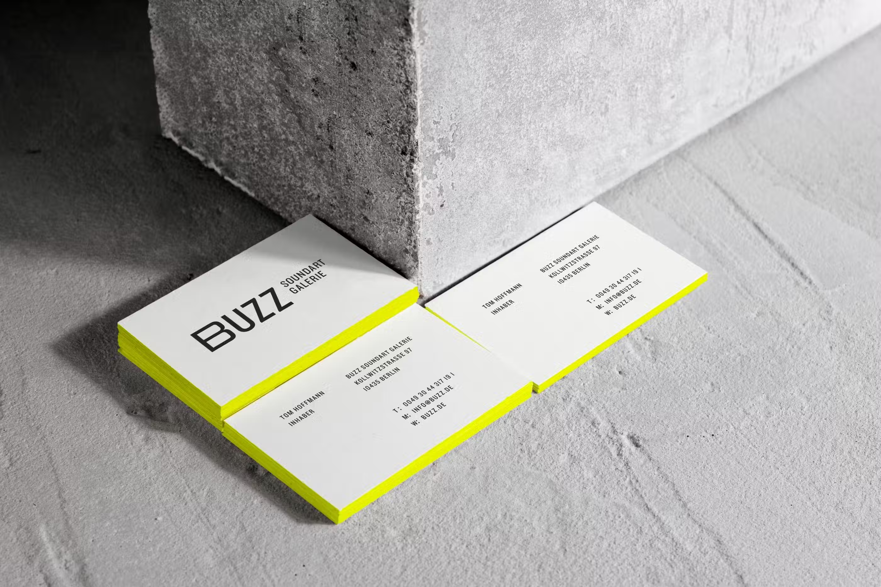
Buzz Soundart Galerie
In 2021, the studio received a commission to brand Buzz Soundart Galerie, an avant-garde exhibition space in Berlin, Germany. This unique gallery serves as a platform for sound installations, live performances, and workshops curated by leading sound artists from across the globe. These artists often provoke and immerse visitors in multisensory experiences.
Year
2021
Services
Branding, Identity Design, Naming, Editorial Design, Poster Design
Industry
Arts & Culture, Music, Events, Entertainment
Collaborators
Piyush Bansal


VERBAL IDENTITY
The owner of Buzz Soundart Galerie has a profound mission — to foster societal self-awareness and engage a younger generation in meaningful dialogues. Traditional exhibition spaces in Germany often draw affluent middle-aged audiences, and we aimed to break free from this stereotype. The brand name, Buzz Soundart Galerie, was carefully chosen to capture the low hum of sound art and the lively atmosphere it embodies.

We sought to eliminate the traditional gallery's intimidating aura and adopted a provocative and humorous approach, reflected in our slogan, "No sound is safe here." The exhibition names also follow this bold approach, with the first exhibition titled "This is the End."


VISUAL IDENTITY
The visual identity heavily relies on typography, with words and phrases forming simple shapes that double as signage and pattern systems. They developed noise patterns to represent the unique relationship between humans, wires, and machines in the urban environment. Neon Yellow, chosen as the primary brand colour for its industrial and assertive presence, underscores the intensity of the sounds.
To instil a sense of unease, they incorporated kitschy images of singing angels into the design. These images were distorted based on the sounds produced by the installations.


Vinyl cover design, soundtrack of the exhibition “This is the End”


Recognitions & In Press
Recognitions
Type
Year
Media coverage
Type
Year
related projects

